Choose one of the fictionary companies and create a logo that embodies the heart of the company’s mission. Use your own critical eye to pick a font that works well with your choice and is easily readable yet unique enough to stand out. Choose a color or colors that underscore your company's business model. Think about a graphic that goes with your type treatment or can integrate in an interesting way into your type treatment
The Ask
Island Flowers is a florist located on Martha’s Vineyard, an island off the coast of Massachusetts. Specializing in private estate florals, corporate events, weddings, and florals for the local hospitality industry, we are the island’s premier florist. We believe the space that surrounds you affects how you feel and should reflect your passion for life with art that inspires, hues that rejuvenate, and florals that heal.
Company Mission
Logo Brainstorm


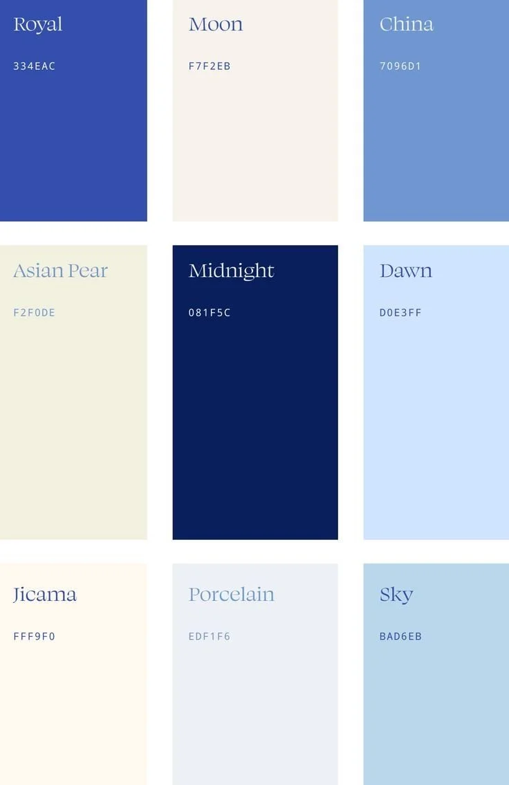
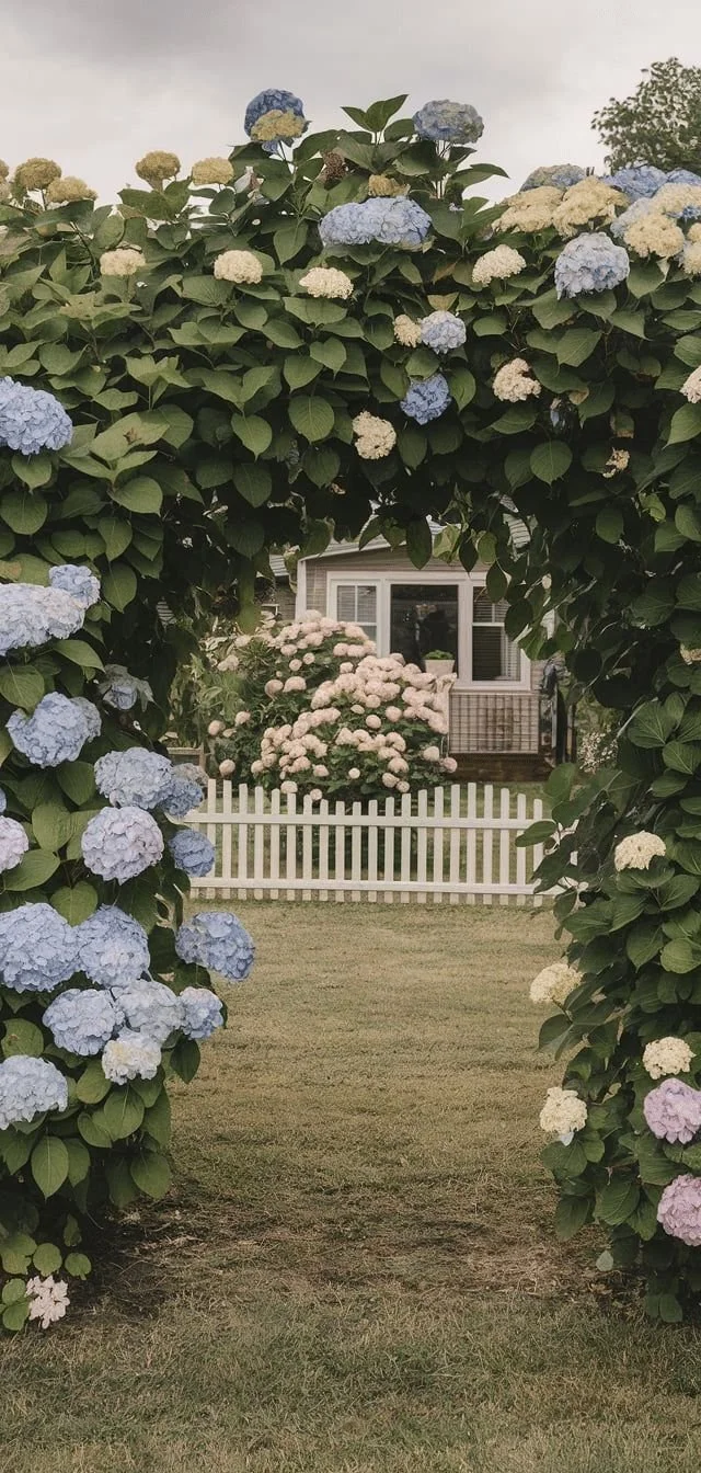
I started by listing ideas for colors and graphics that came to mind when I thought of the brand “Island Flowers”. Naturally, my mind went straight to flowers, specifically hydrangeas, as they are a Martha’s Vineyard staple. But then I felt a calling to use a lighthouse in the logo. That’s when I started experimenting with incorporating the lighthouse, from it being the center of attention with the bottom left design, to it being more subtle on the top left design. Then I experimented with pulling coastal colors to get a full feel for the brand.
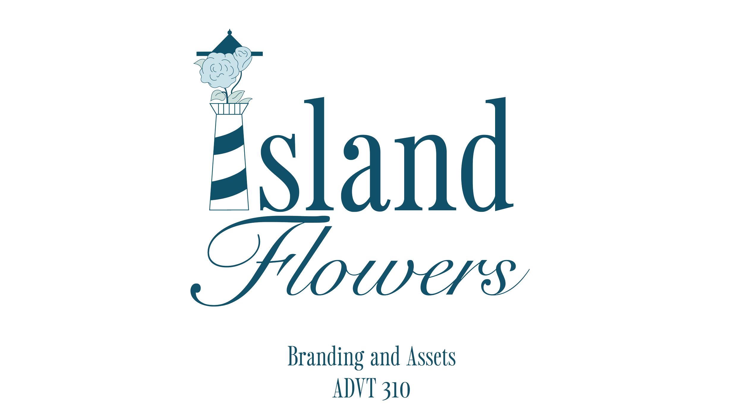
Final Logo Design:
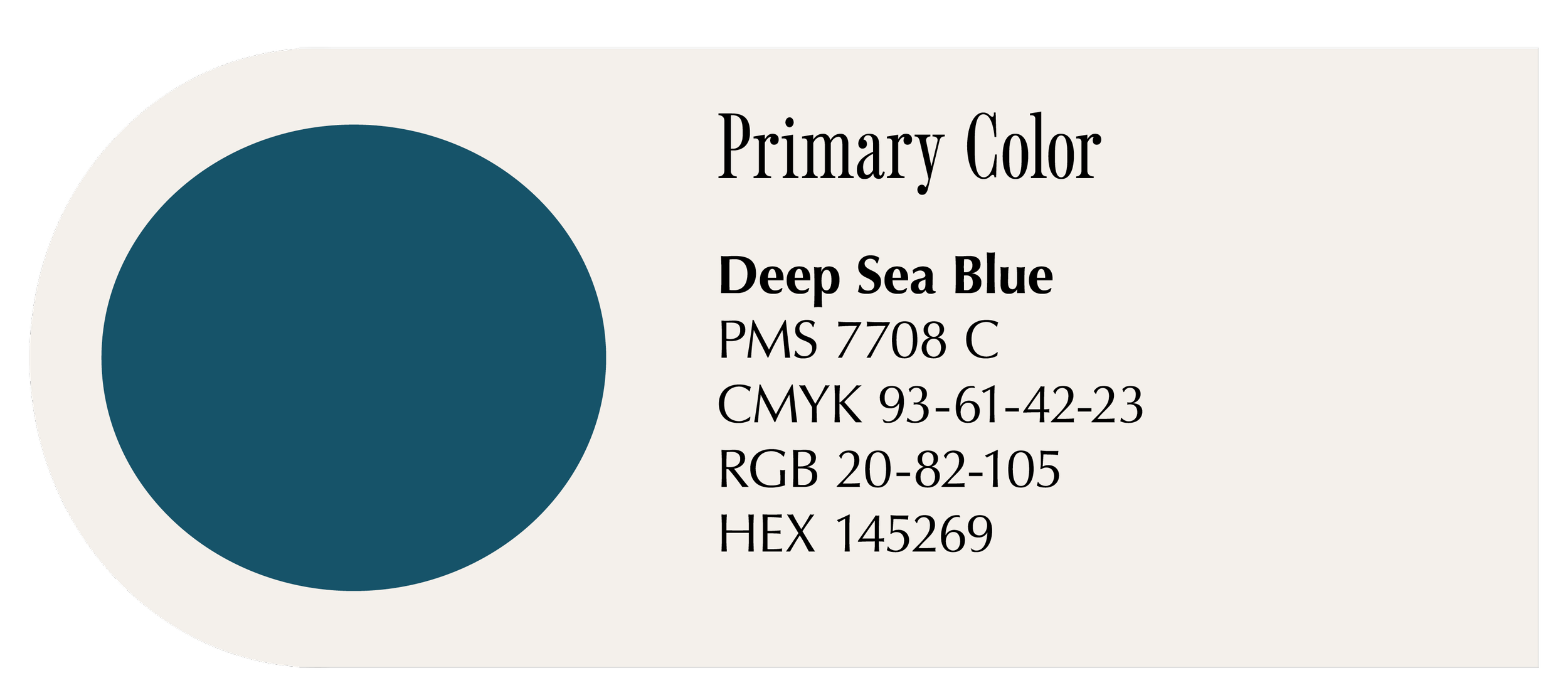
After experimenting with various layout options, I ultimately decided to replace the “I” in “island” with a lighthouse, which added a unique and meaningful visual element. I also explored incorporating floral accents, and was pleased with how seamlessly they blended into the overall design. The color palette, inspired by the soft coastal tones of Martha’s Vineyard, became a consistent thread carried throughout the branding process.

Brand Identity Guide:
Once I finalized the logo design, I was able to develop a complete brand identity guide. For the brand fonts, I drew inspiration from my research into “old money” aesthetics, where I noticed a common use of stretched serif typefaces. I also explored brands associated with Martha’s Vineyard and studied their typographic choices. In the end, I chose Sailing Club—a nostalgic serif font that evokes the look of a vintage college sweatshirt. To complement it, I paired it with Snell Roundhand, which added a perfect touch of flair.

Creative Assets
-
![]()
Bag Tag
-
![]()
Shop Bag
-
![]()
Tote Bag
-
![]()
Exterior Shop Sign


